
Personalised Cable Onboarding
Date: 11.2022 - 04.2023
My Role: UX Design, User Testings, and Research
The Cable onboarding process consists of two primary features: 'Self-installation' and 'Technician-Installation.' The self-installation feature is designed to enable users to easily set up their router and WiFi booster independently. The technician installation feature provides users with clear instructions on how to prepare for their technician appointment and install the WiFi booster on their own.
The new onboarding flow is personalized compared to the old public flow. Only relevant information like instruction and manuals is given to users, based on their orders and routers, ensuring a more tailored and streamlined experience.
The Project Goal
Make self and tech- installation easy to complete
Increase digital assisted channel usage, up to 70%
Modern Vodafone design, aligned with WS10 strategy
Status Quo
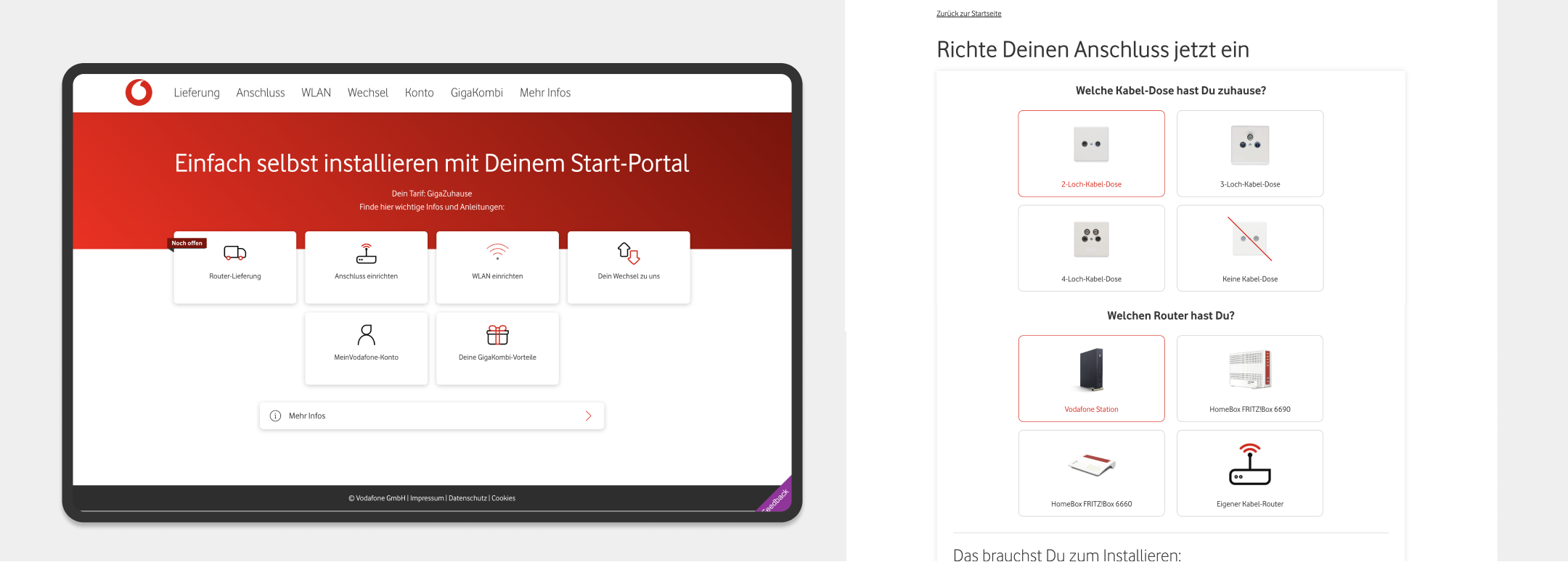
Landing page
User Research | Quantitative & Qualitative Data
For the user research phase, I utilized four different types of data: User testing result, Heating map, Medalia data (NPS & Customer Effort Score), Call centre feedback, and Customer interview
Upon taking on this project, I first reviewed the user testing results conducted by a former designer in order to gain insights into users' behaviors and emotions regarding the current flow. The results indicated that users felt overwhelmed by the numerous options on the landing page and were unsure of the next steps required to install their router.
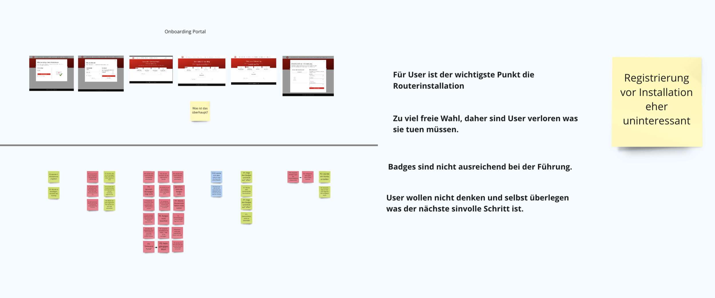
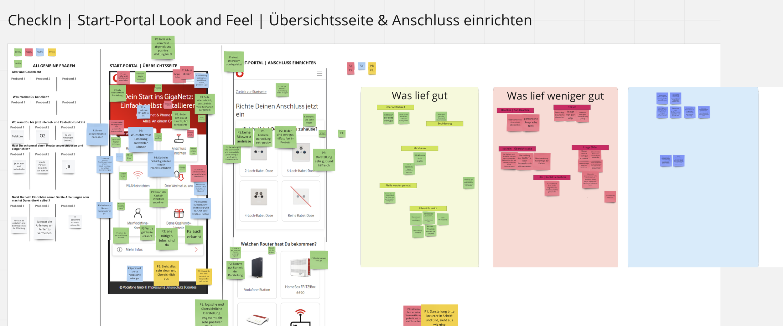
Unfortunately, our Adobe tracking system is currently down, resulting in a lack of product usage data. However, before the system went offline, I was able to glean some key insights: 90% of our customers access our products via mobile devices, particularly on 414px and 360px screen sizes. This clearly indicated that we needed to focus on optimizing our design for smaller screens.
To further investigate this and compensate for the missing quantitative data, we shifted our focus to qualitative insights. In collaboration with an editor and a UX researcher, we conducted 'Stunde mit Kunde' (Hour with the Customer)—a series of 30-minute user interview sessions with three customers. Simultaneously, our customer manager gathered additional direct feedback through the call center.
Quantative Data Analysis
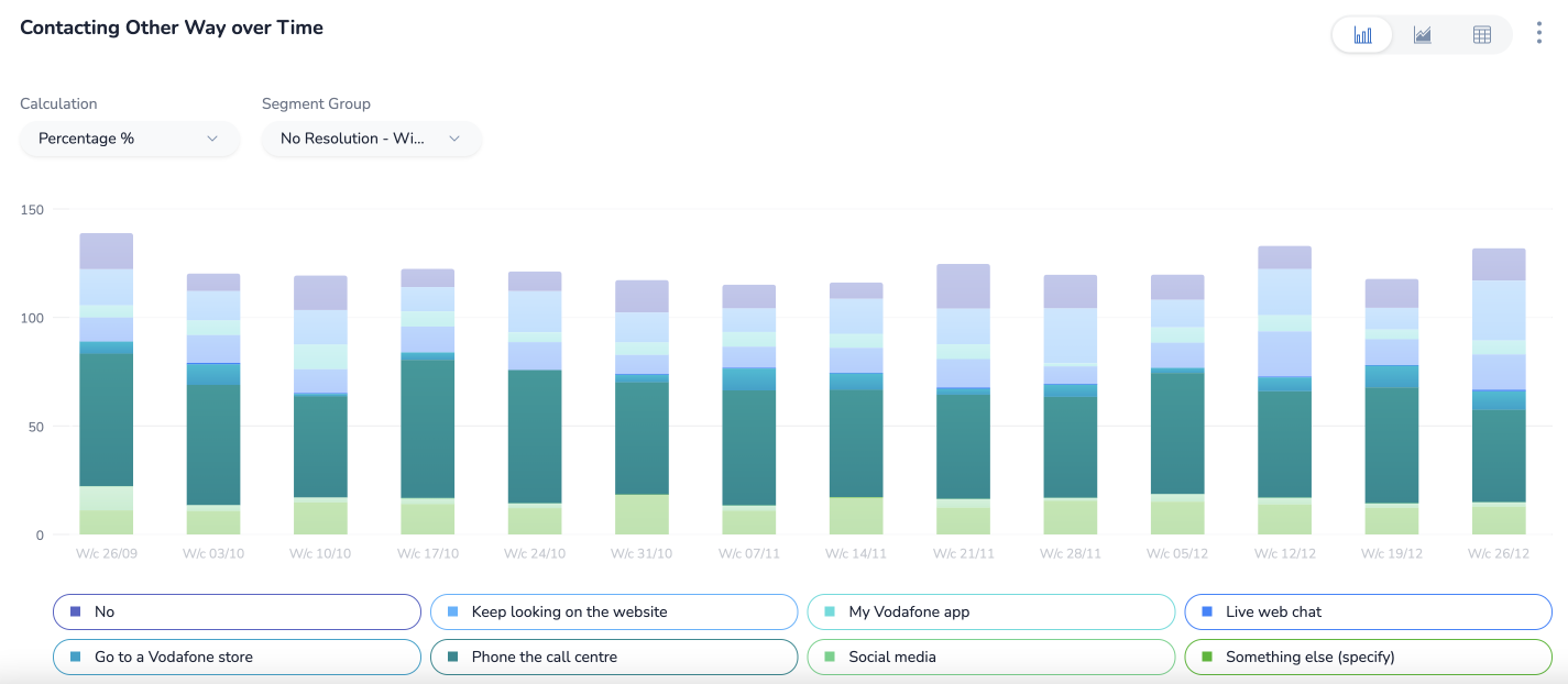
Through an analysis of Medallia data, I found that many customers still heavily rely on analog help channels, such as visiting Vodafone shops or contacting our call center for assistance.
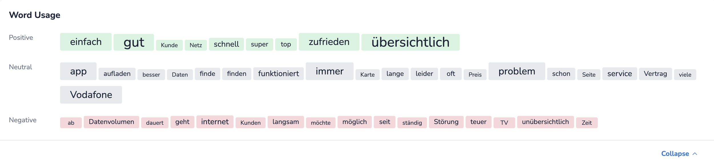
To understand the root cause, I analyzed customer feedback and identified several recurring keywords, including 'Slow,' 'Time,' 'confusing,' and 'unclear.'
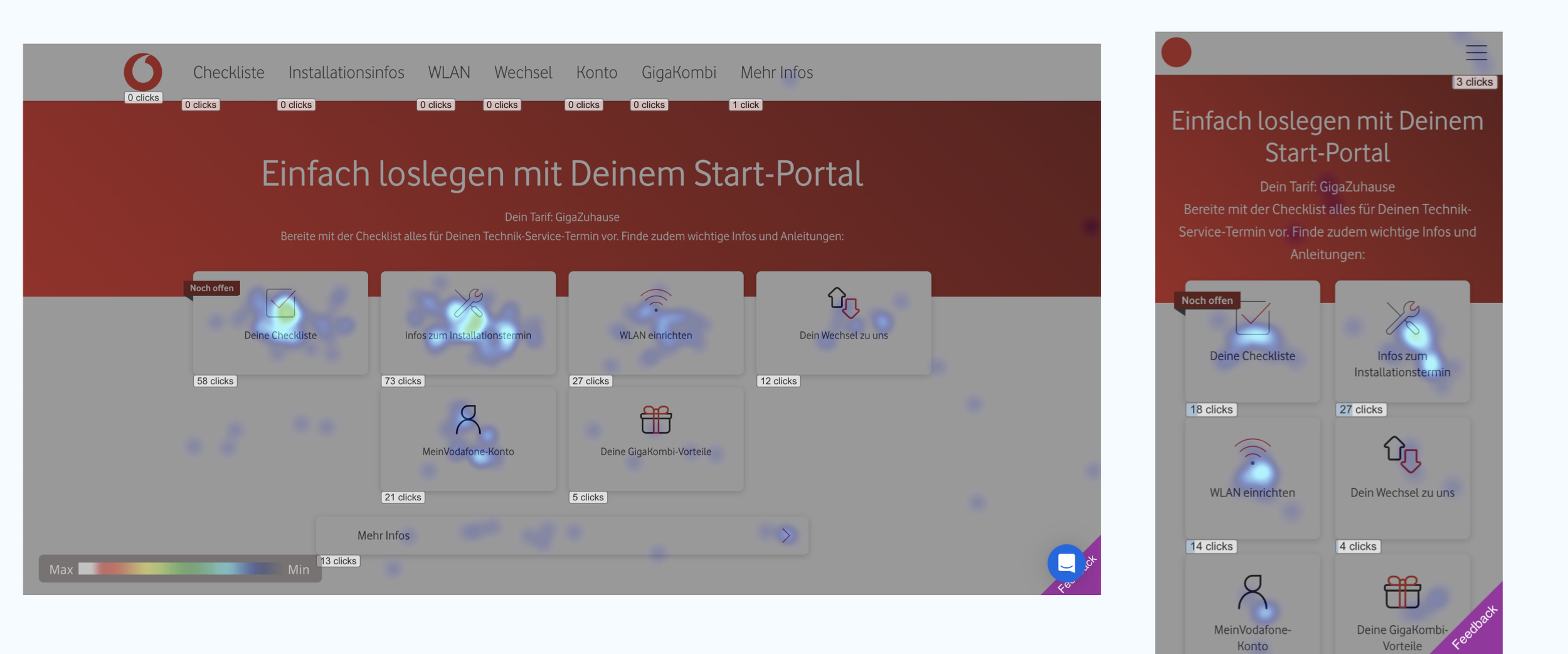
This friction was further validated by heatmap analysis, which revealed that users frequently get lost on our platform, interacting with the content in ways that deviate entirely from our design expectations. Together, these insights suggest that an unoptimized digital experience is driving customers away from our self-service channels and toward more costly analog support.
Qualitative Data Analysis
Setting a Design GoalMake self and tech- installation easy to complete
Increase digital assisted channel usage, up to 70%
Modern Vodafone design, aligned with WS10 strategy
Design Solution
Step-by-Step Onboarding Curation (Core Focus): Spearheaded a structured, step-by-step onboarding process aligned with the WS10 strategy, using the new design system to eliminate landing page overload and guide users intuitively.
Mobile-First IA Re-engineering: Overhauled the content hierarchy for dominant mobile viewports, ensuring logical scannability and faster information findability.
2. Develop Concept for Self- & Tech-Installation
After analyzing the research findings, I developed UX concepts that aligned with our goals. These concepts were presented in various meetings, including design alignments and sprint reviews, to gather feedback from internal stakeholders, chapter designers, and Center of Excellence.
Here are key two UX focus aligned with goals.
A Clear Step by Step Guide
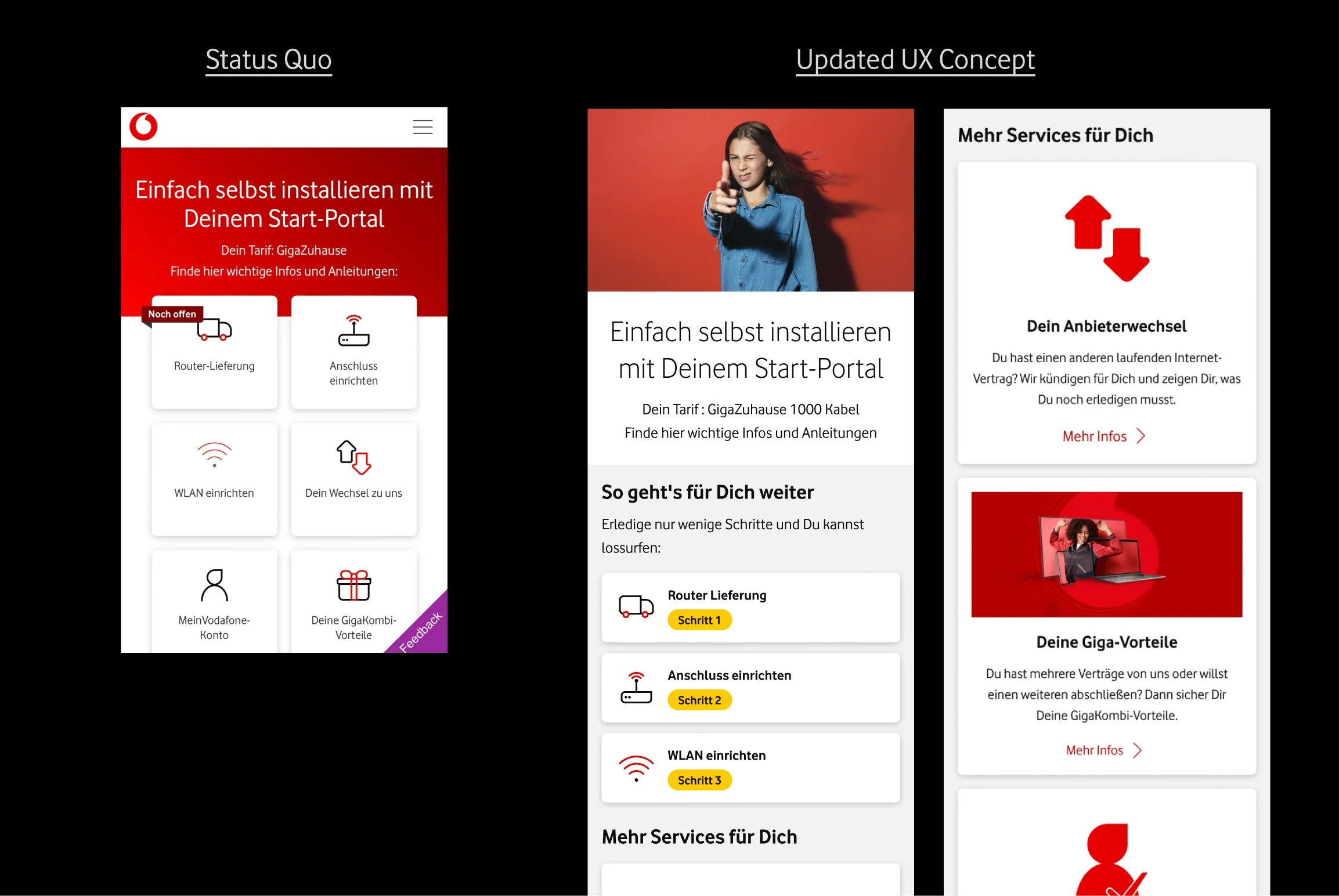
I improved the user experience by dividing content into "Steps(Schritt)" and "More Services(Mehr Services)" sections, providing clear and direct access to the essential installation process. The "Steps" section creates a seamless flow by indicating what the user needs to do next and marking tasks as "done" upon completion.
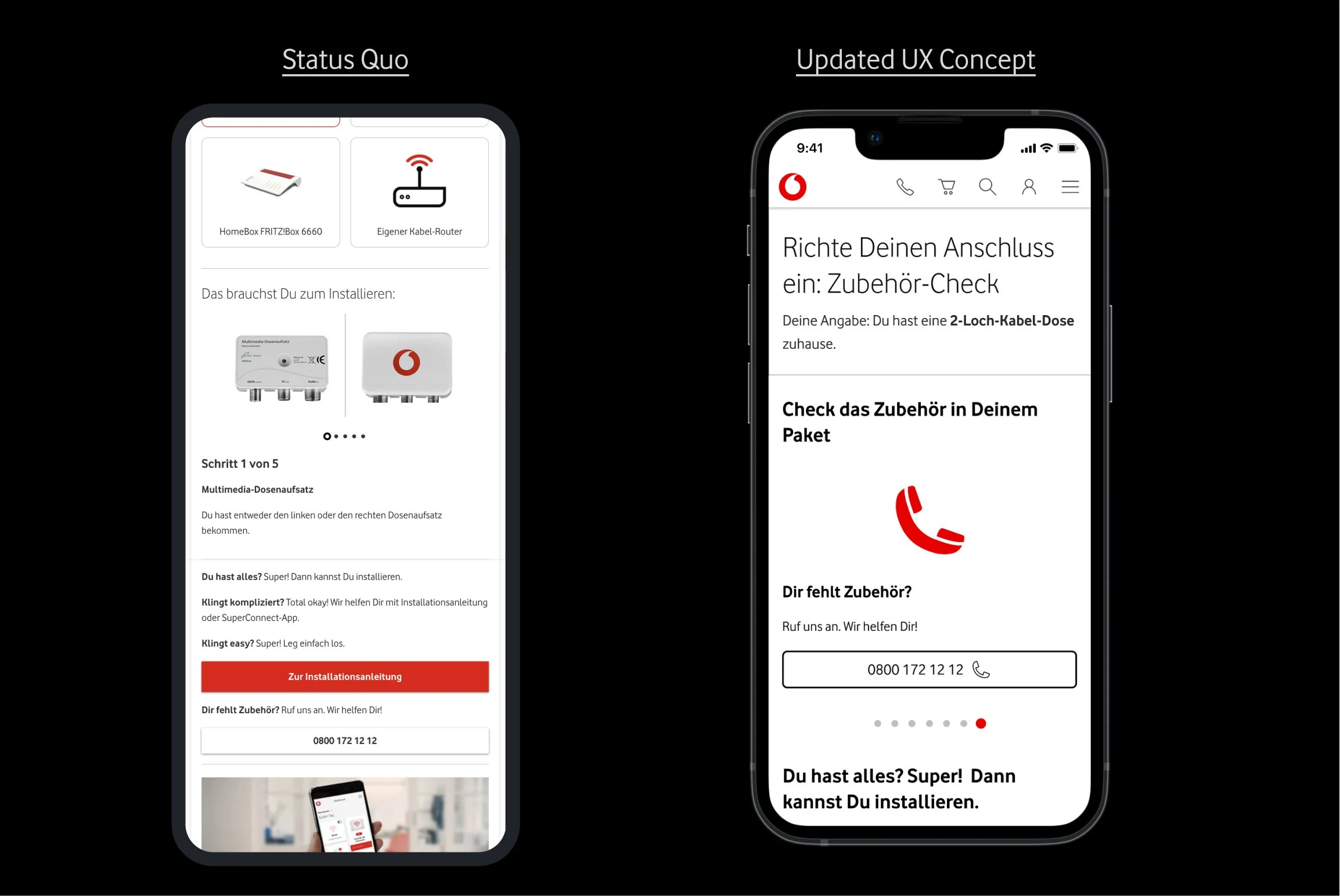
Display a Call Function Where Users Really Need
One of the design goals was to reduce the number of unnecessary calls, even though users initially thought having a call number showed transparency. Through research, I discovered that users tended to abuse the call function, leading to higher call volumes.
To address this, I placed the call function only when necessary, specifically on the last slide of the carousel pattern, where user engagement tends to be lower. This allows users to easily view the required equipment for installation and only use the call function when needed.
3. Propose Two Versions
Through several iteration, I finalised two versions in Self and Tech installation, since we have different opinions, aligned with other products and accessibility standards.
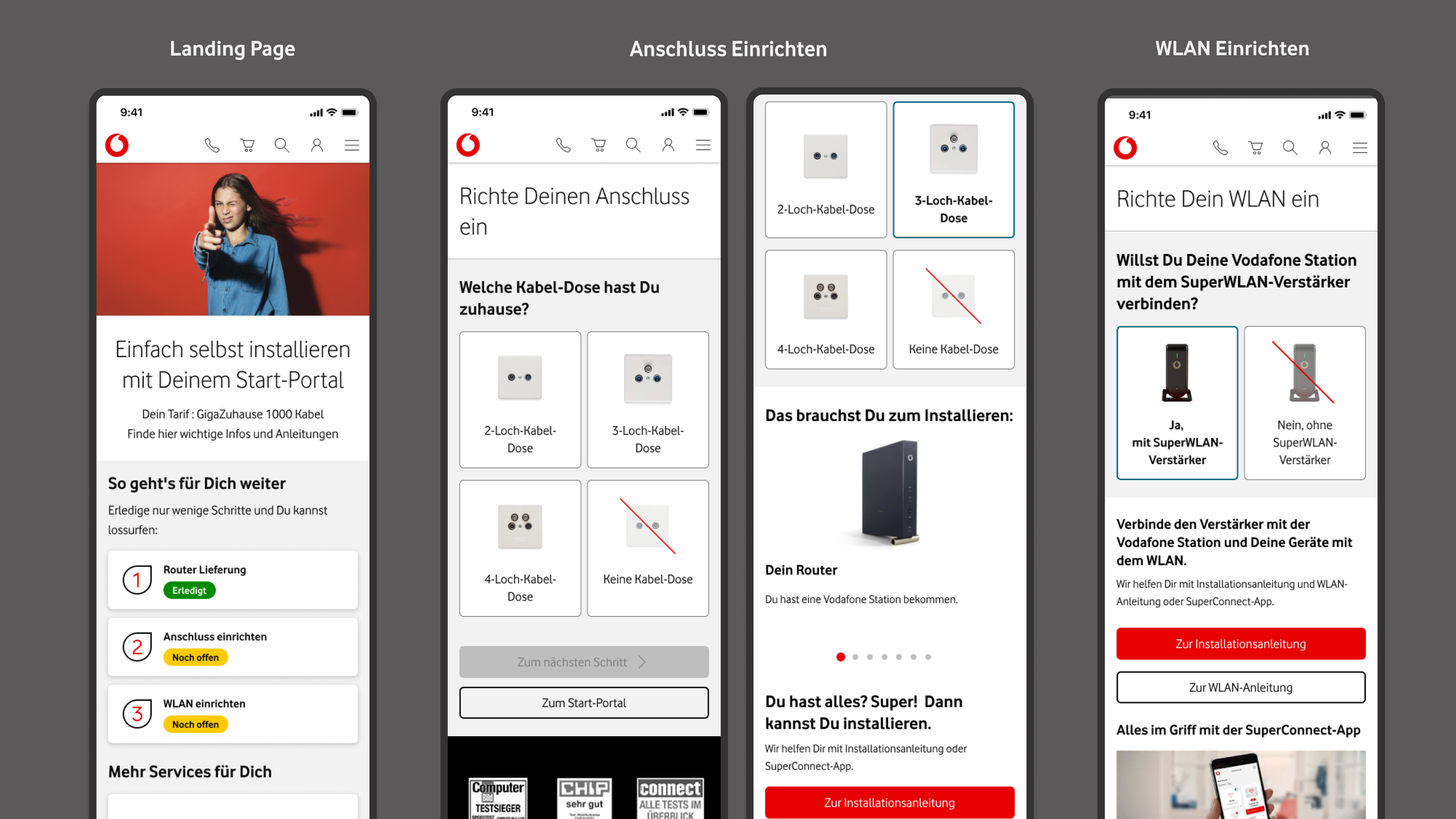
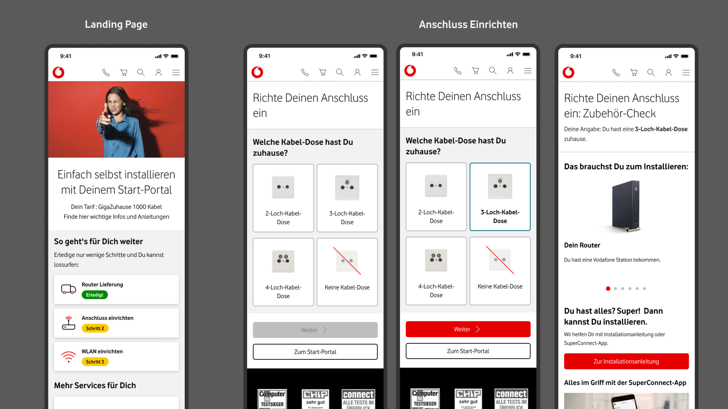
Ver A: Customer feedback focus
There are two main differences between the two versions. The first difference is that the mid-render icon now shows the progress of the steps and the highlight badges provide more details about the status of each step.
The second difference is the inclusion of a "Decision-Tree" module that displays the option picker and its result on the same page, which received positive feedback from users. However, it does not meet Vodafone's accessibility standards and needs to be improved.
Ver B: Vodafone Standard
On the landing page, I adjusted the highlight badge labels to clearly indicate different steps and icons illustrate titles.
For the "Anschluss einrichten" and "WLAN einrichten" pages, I separated the option picker from its result page to maintain Vodafone's accessibility standard and ensure clear guidance for users. While customers preferred having the option picker and its result on the same page, I found that separating the pages improved the clarity of installation guidelines and reduced the need for vertical scrolling. This is because users typically have only one device to select from on the option picker, making the need to redefine options less common in actual usage.
Explore Prototypes
3. Validate Concept via User Testings
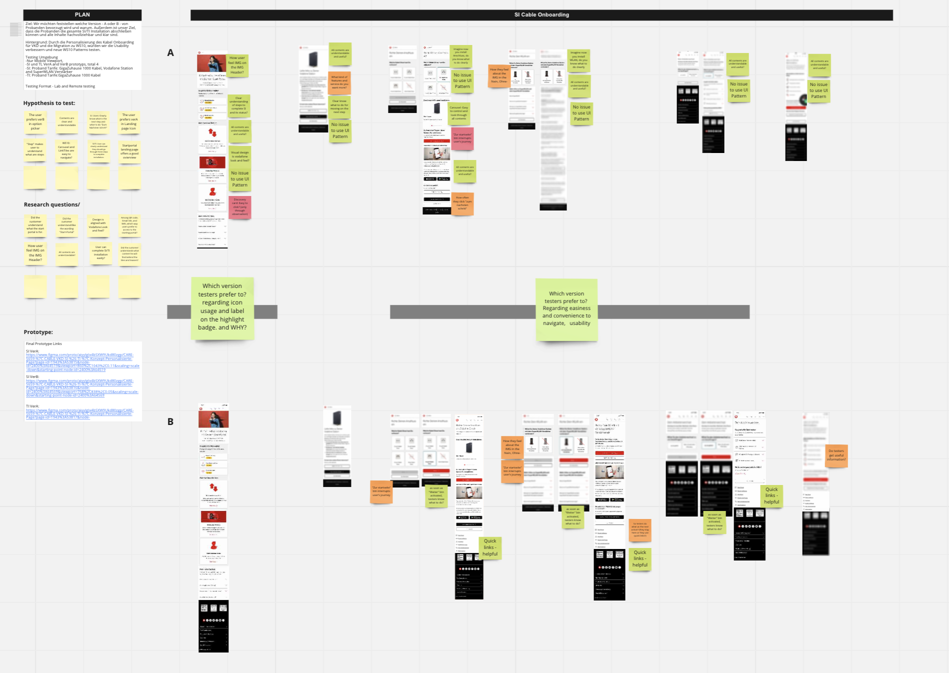
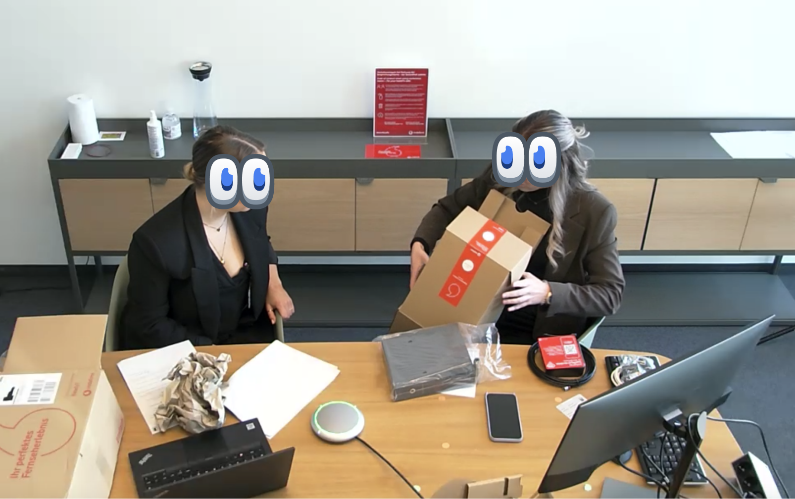
During the two-day user testing and interview sessions, I collaborated with UX researchers to gather insights into how users behave and install the router by themselves. To simulate real-world scenarios, I suggested to bring actual routers, accessories, and WLAN boosters to the lab and set up an installation stage for users to interact with physical devices.
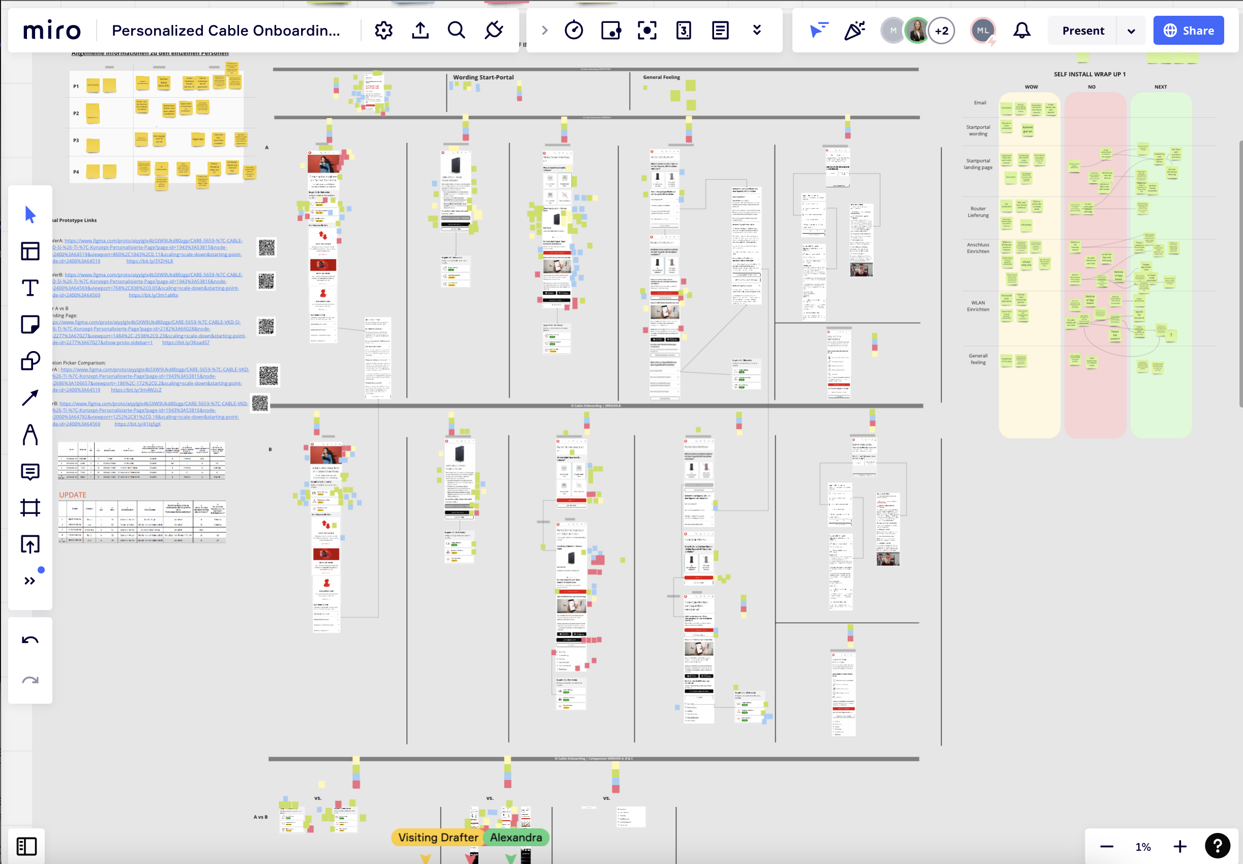
To guide our research, I developed prototypes and designed user tasks, hypotheses, and research questions. By analyzing the data and feedback collected from the testing, I was able to identify pain points, usability issues, and opportunities for improvement in the self-installation process.
4. Define Next Actions Based on Testing’s Results
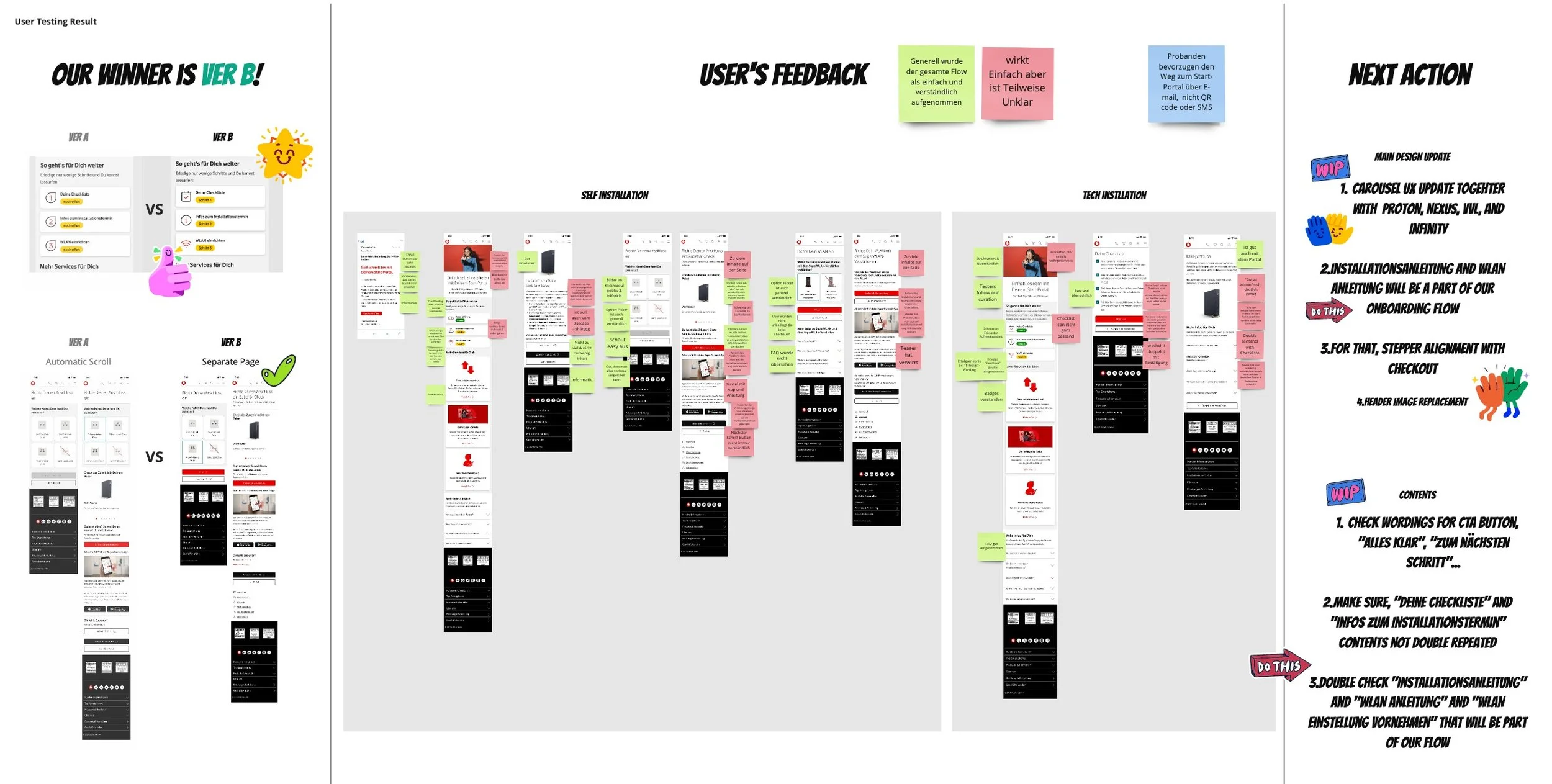
Based on the user testing feedback, we determined that Version B, the Vodafone Standard one, was the better option as it provided a clear and comprehensive overview of the installation process with easy-to-follow steps. Testers found the installation process to be straightforward and uncomplicated. However, we also identified areas that needed improvement.
To address the feedback, we held team discussions to determine the next steps and shared our findings and recommendations with stakeholders.
Next Actions
Think of how to encourage users to stay in our onboarding flow to complete installations rather than moving to the online help products.
Enhance accessibility and usability of the Carousel pattern.
Change wordings in CTA elements to make them clear such as “Alles Klar(Everything is clear)“, “Zum nächsten Schritt”(To next step).
Redefine which patterns should be usable and developed. For that, it needs alignment with other Chapters.
Integrate TrackmyTechie to track on Technician.
5. Finalise UX Concept
I oversaw the finalisation of the Cable Onboarding Flow by implementing the next steps that were defined earlier. This involved integrating the installation guidelines into our flow, updating the Carousel and Stepper patterns, and making changes to the header and content.
To ensure that the final UX and spec of the above patterns met the requirements of other squads, I led all alignments and guided the change of editor wordings. Additionally, I worked with a release manager to reschedule the development of the patterns.
As part of my role, I also explained to the PO the importance of integrating installation guidelines into our product, based on my understanding of the customers and their experience.
Before
After
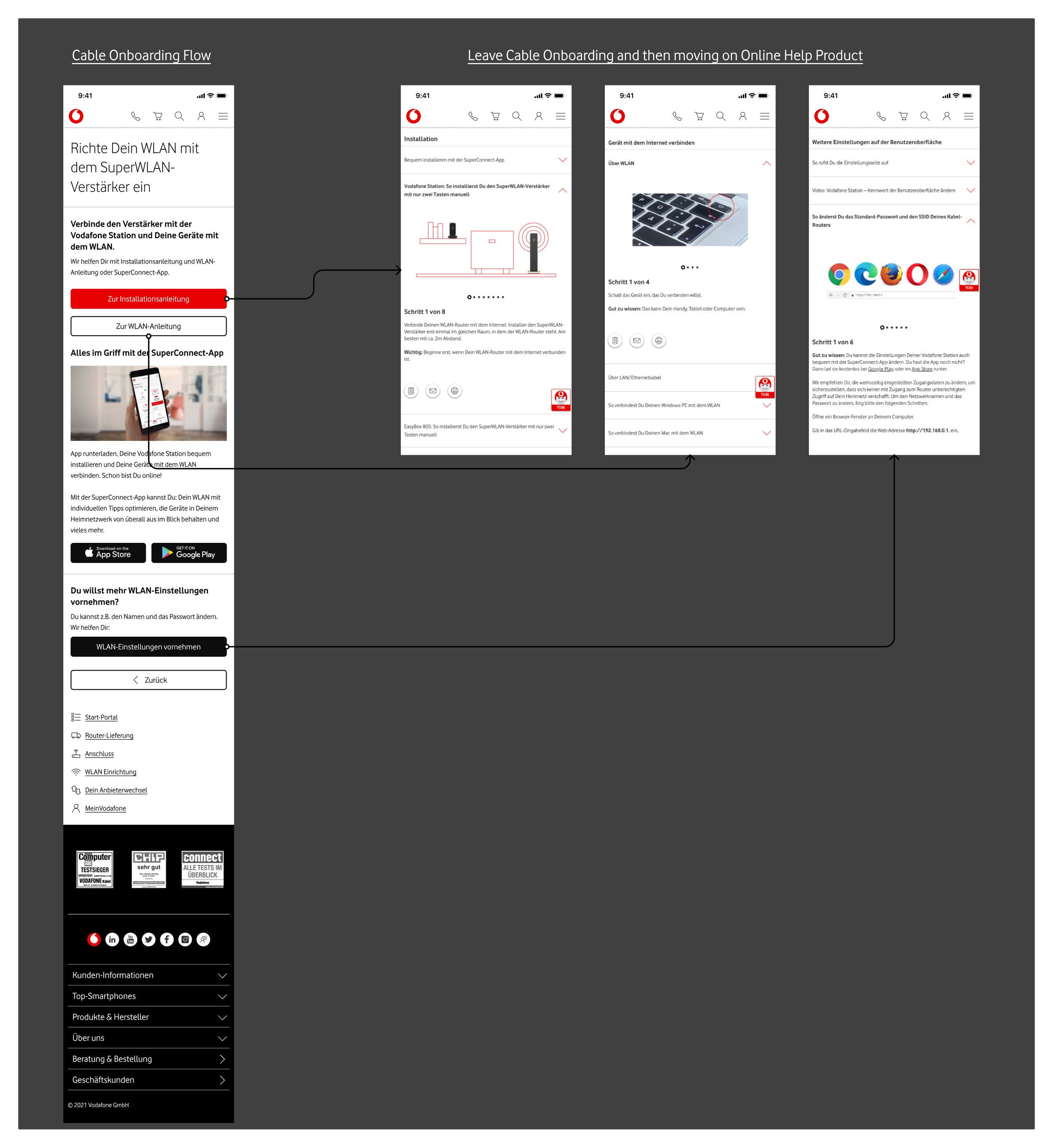
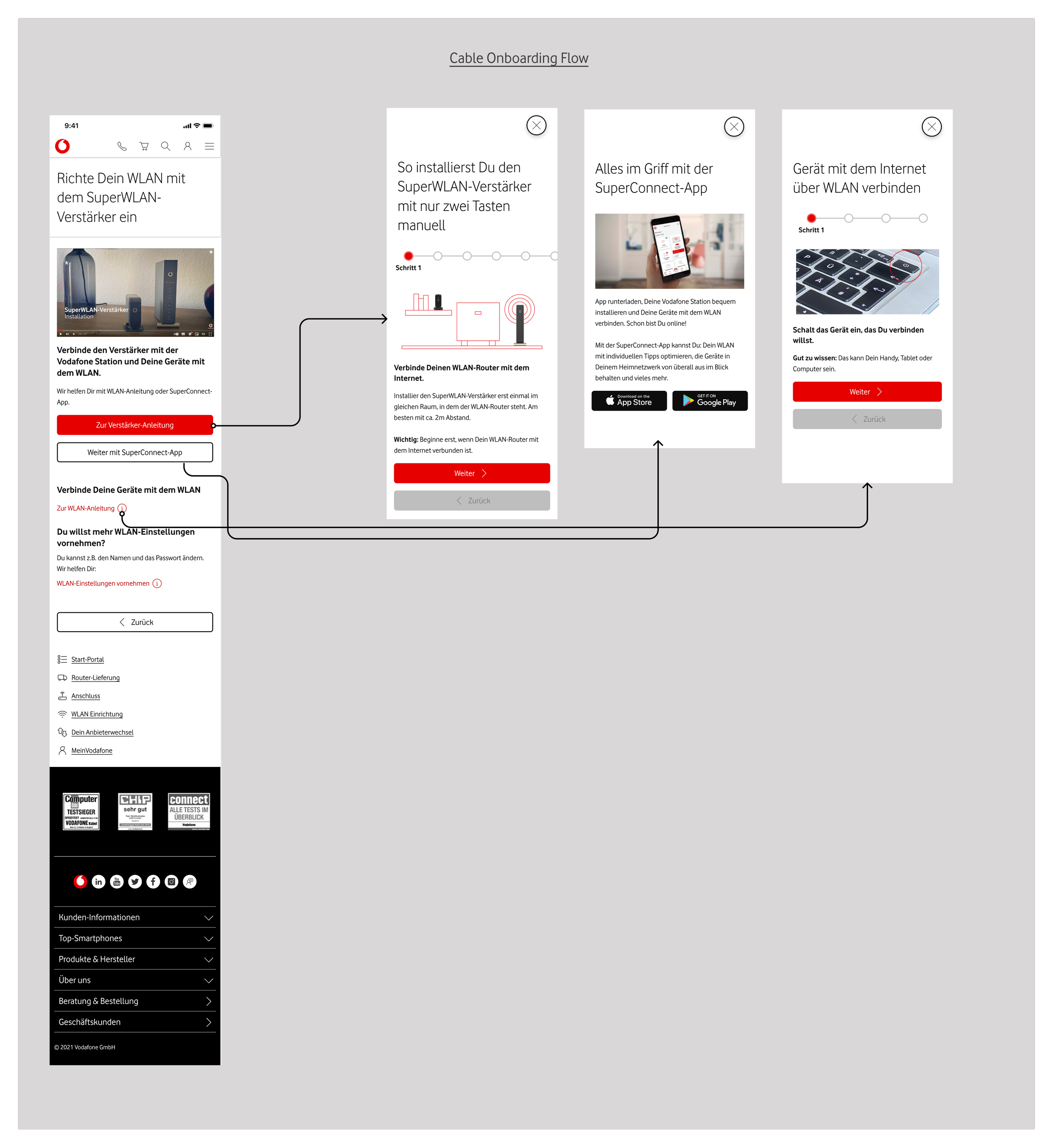
1.All Installation manuals are positioned in Online Help Page so, users are never back to our flow to continue with broken user experience.
1.With adding video and using overlay pattern, all manuals are placed inside of the flow. Thus, users can complete installations more quickly.
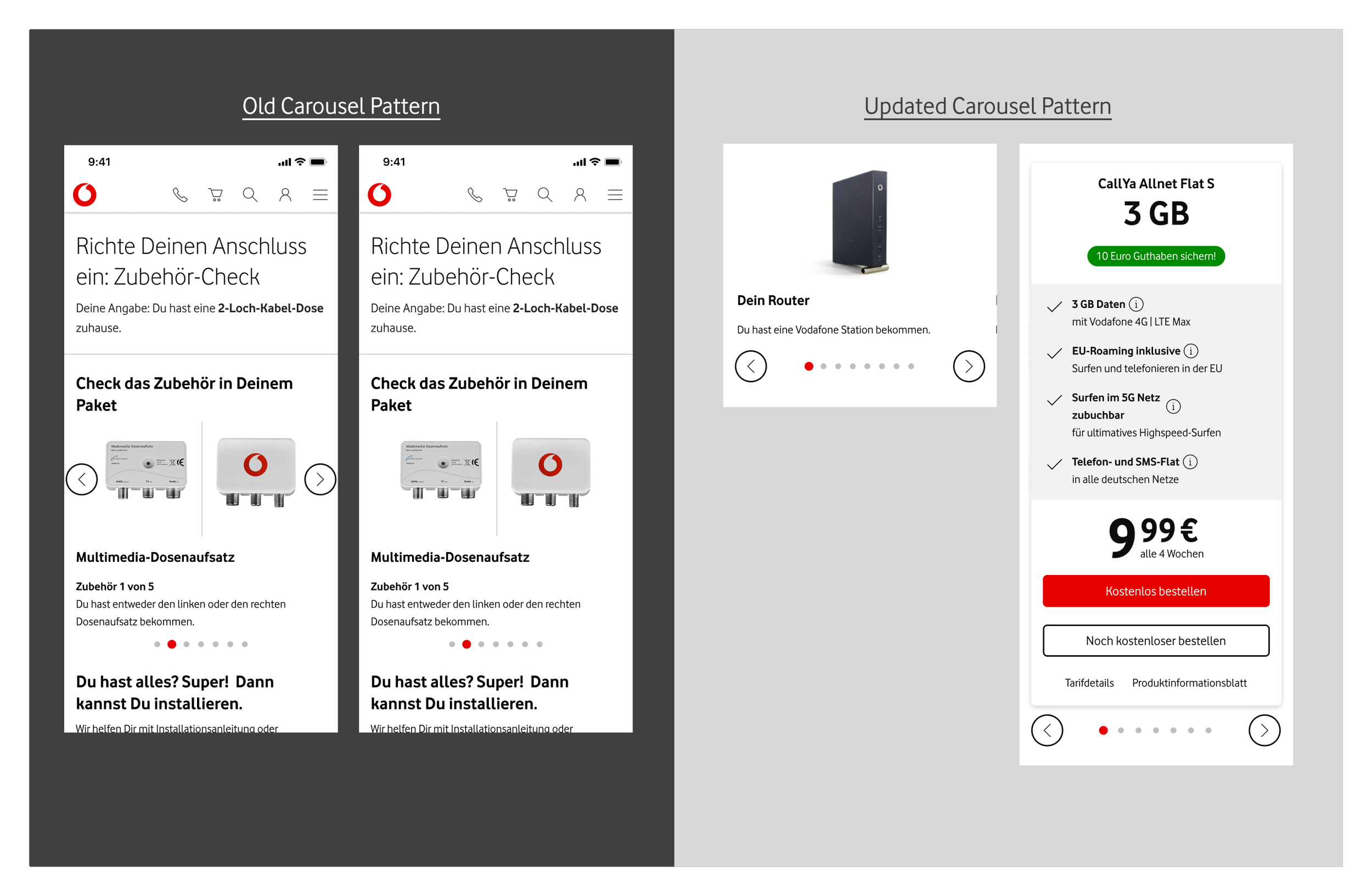
2. Update Carousel Pattern to improve usability and accessbility and make sure this pattern also cover prepaid squad’s use cases
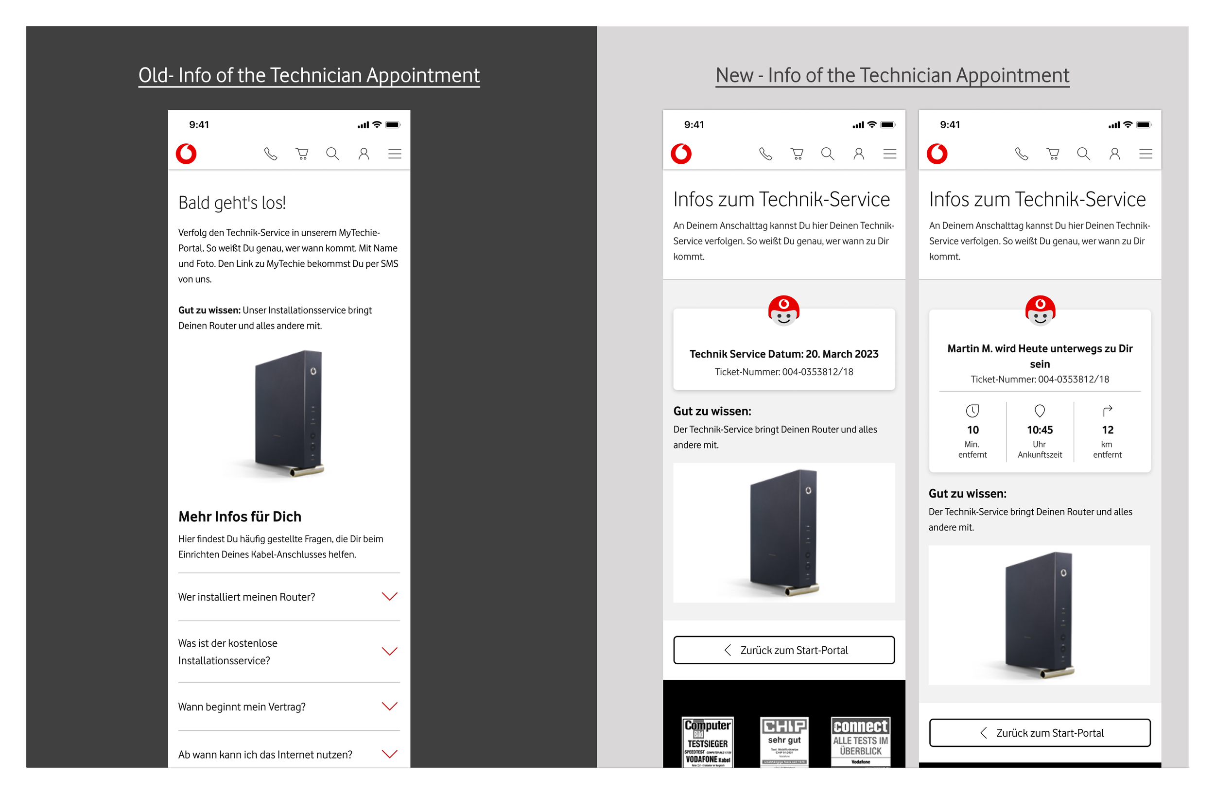
3. Lastly, aligned with Solstice project status (Integrating different backend programs from KabelDeutschland, Unity media, and Vodafone into one I updated its Technician Info Service’s concept )
6. Define Patterns in Design System
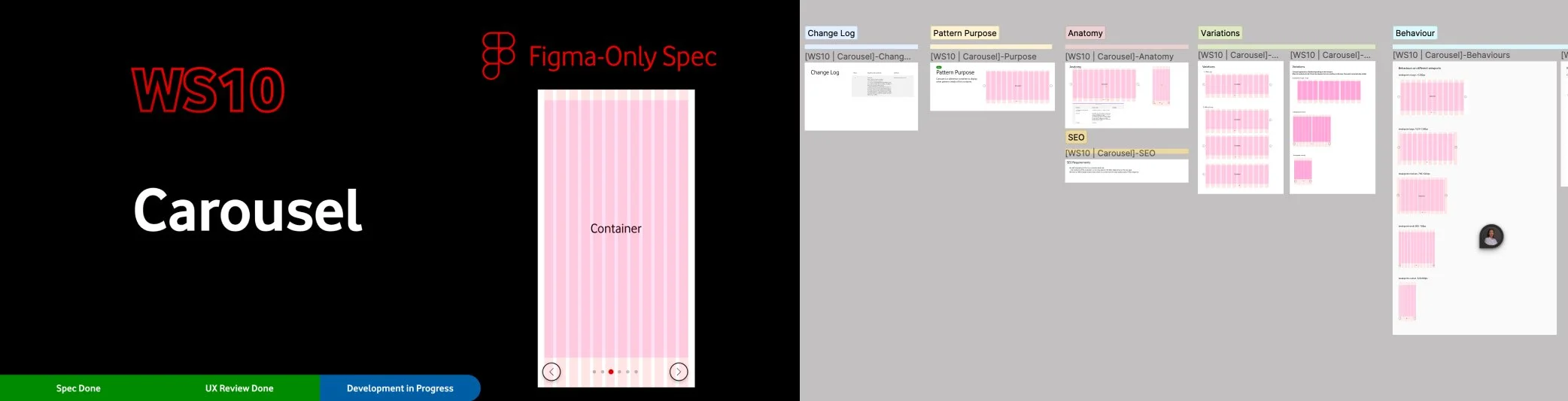
Concerning reusability of UI elements in other products and through alignments with CoE, and, I determined which patterns should be a part of Design Systems. I validated that three patterns: Carousel, LinearStepper, and LinkTiles are qualified as design patterns with having an overview how they are applied to different journeys. Therefore, I designed concepts and spec of LinkTiles and Steppers by clarifying technical problems, considering all use cases, and SEO. Moreover, I mentored intermediate designer to specify concepts.

7. Impact
-17% Drop
Call centre usage rate
+21% Uplift
Digital Assisted channel usage