
How to Navigate Users to the Right Category
Date: 05.2024 - ongoing
My Role: UX Lead, Research, Data Analysis
Based on insights from Medallia data and user interviews, we identified that many users felt frustrated when trying to find the right product or category. They often expressed uncertainty about whether they were browsing in the correct category.
To address this, we conducted multiple A/B tests and in-depth data analyses to identify solutions that improve navigation clarity and guide users confidently to the right category.
Design Process
Data analysis to identify user’s problem
Formulate an opportunity
4 Iterations : AB Testing <> Data Analysis
Step back and data analysis with depth
Run 5th AB testing
Data Analysis to Identify Key User’s Problem
User’s Problem
As the user, I’m not sure if I’m in the right category. I want to navigate to the correct one so I can find the right products.
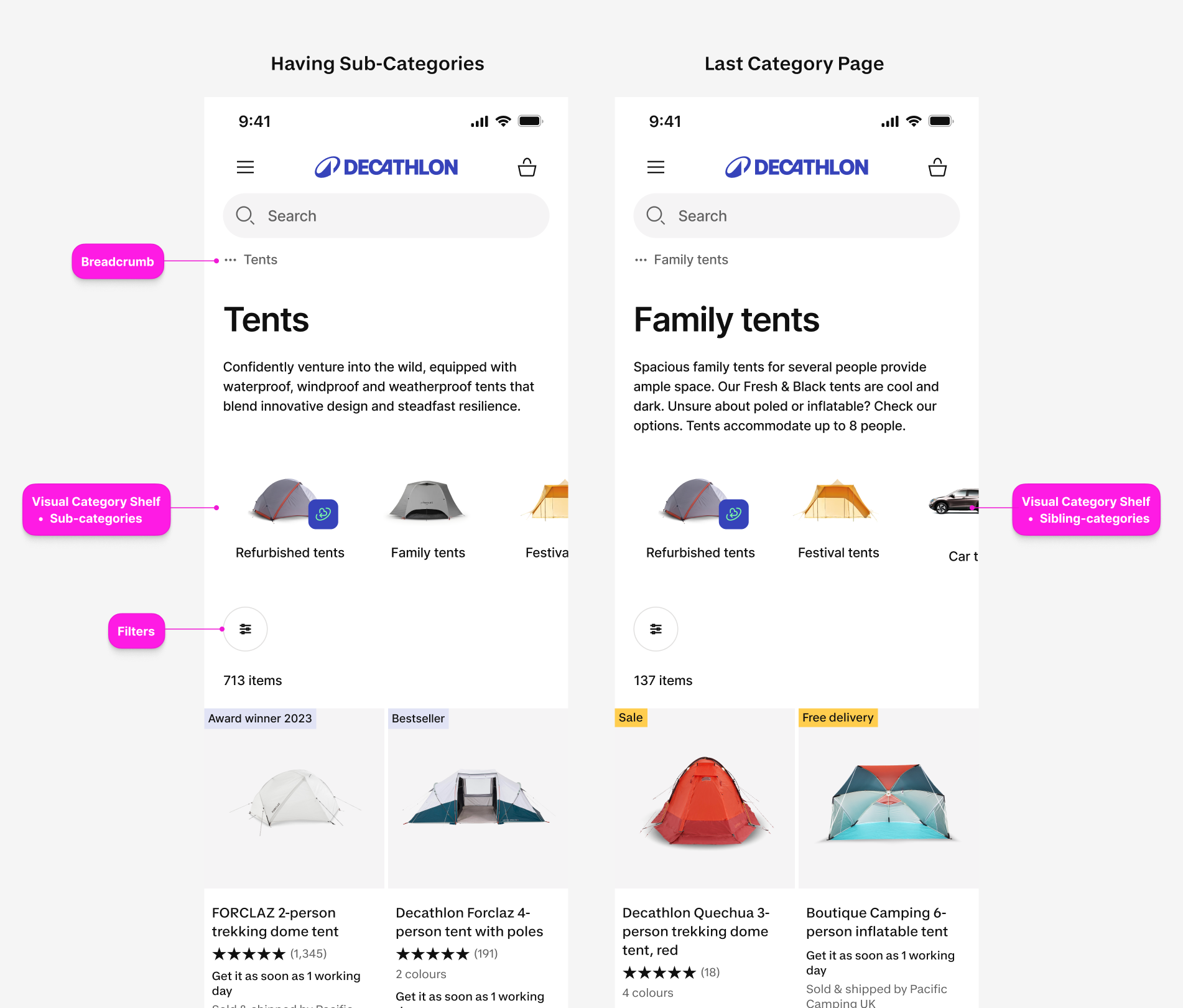
On the PLP, mainly breadcrumb, visual category shelf and filters are responsible for user’s browsing experience. Especially presenting sub categories or sibling categories in the shelf is a key navigation tool according to UT.
2. OST to Align with Our Team Goal
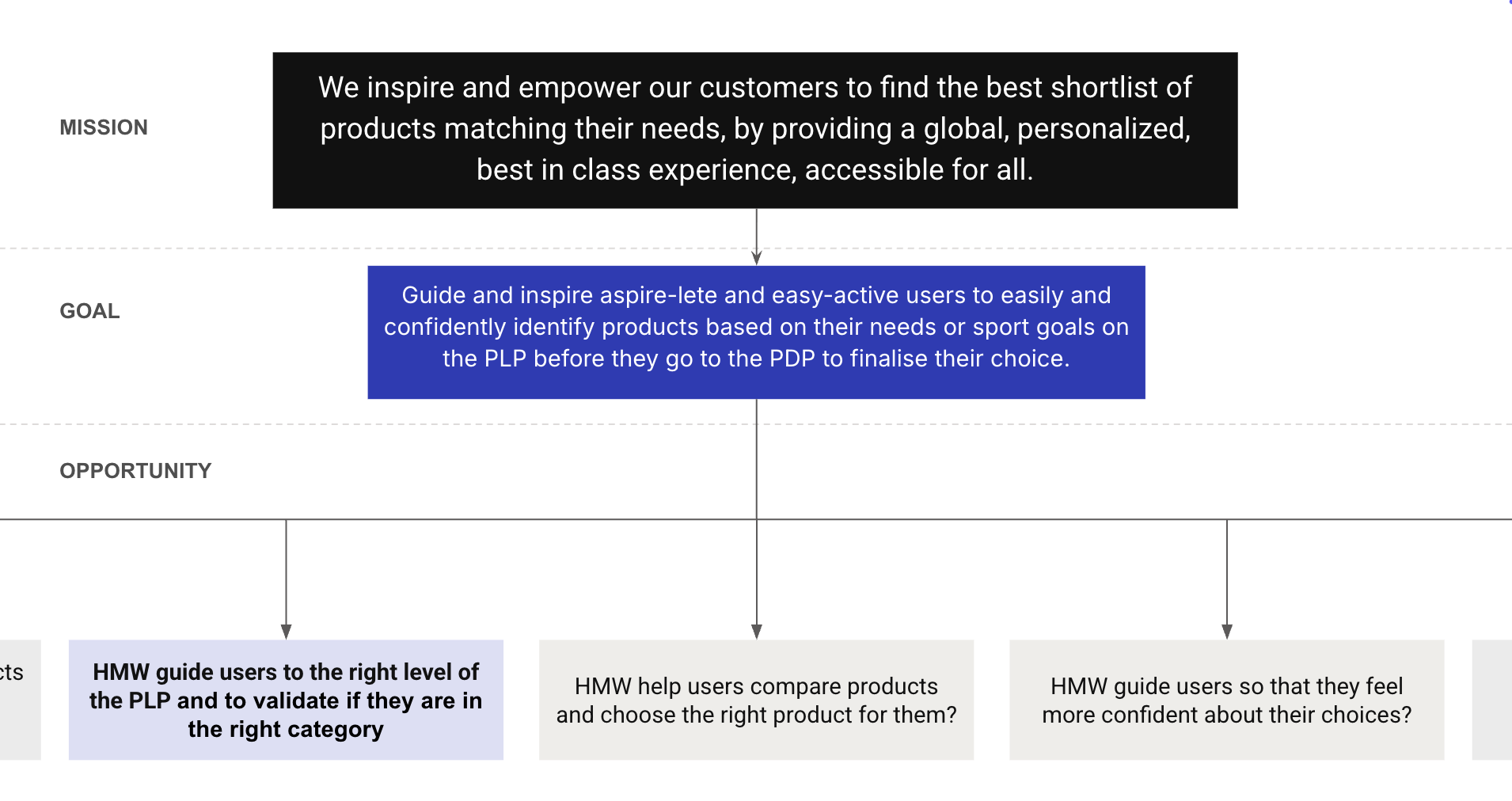
Transformed user pain points into actionable opportunities and validated their alignment with product goals and mission through the Opportunity Solution Tree framework.
3. From Hypothesis to Insight: Iterating for Impact
3-1. 1st Iteration
💡 At the deepest level of the journey, guide users to focus on individual products
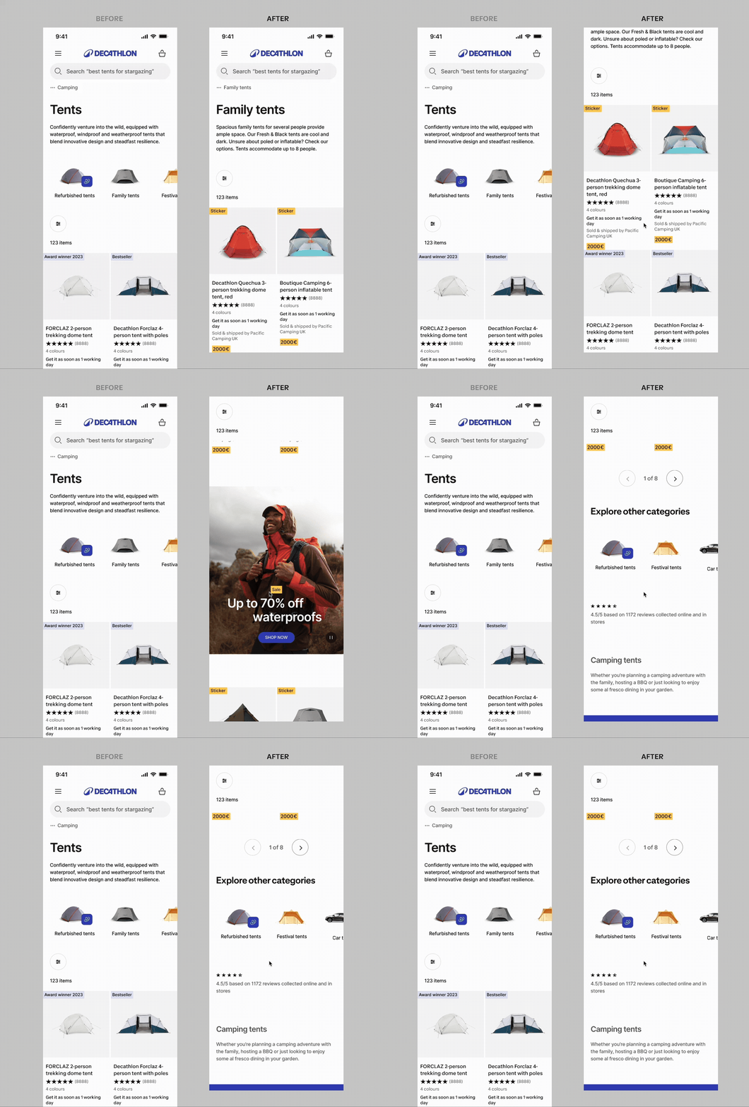
In the first iteration, I placed sibling categories below the product listing on the final category page—a common e-commerce pattern and a Baymard-recommended UX best practice.
[Hypothesis] Showing sibling categories below the listing helps users discover related products more intuitively.
However, the A/B test results showed a flat performance.
CVR: +0,8% ± 1,7%
Filter usage: +7,18% ± 0,9% ✅
Visual filter usage: -10,49% ± 0,47% ✅
💡What I learned
Although widely used and considered a best practice, this pattern didn’t perform well for our product. The experiment revealed issues with our data—for example, users browsing “Walking Boots” still saw unrelated items like “Sneakers.”
In such cases, guiding users to more relevant or similar categories becomes essential to help them find the right product.
3-2. 2nd & 3rd Iterations
💡 Reducing header height to improve category recognition
We reduced the header height to show more product cards above the fold, as the heuristic evaluation revealed that no product cards were visible in the conversion zone.
[Hypothesis] Showing more products upfront helps users confirm they’re in the right category, encourages browsing, and improves conversion.
CVR: +1,1% ± 1,4% (Mobile: Positive +1,3% ± 0,4%)
Add to cart: +1,0% ± 1,3%
Visual filter usage: -9,86% ✅
Product CTR: +0,91% ✅
The solution performed strongly on mobile. Based on this, the third iteration focused exclusively on mobile A/B testing, though results were flat.
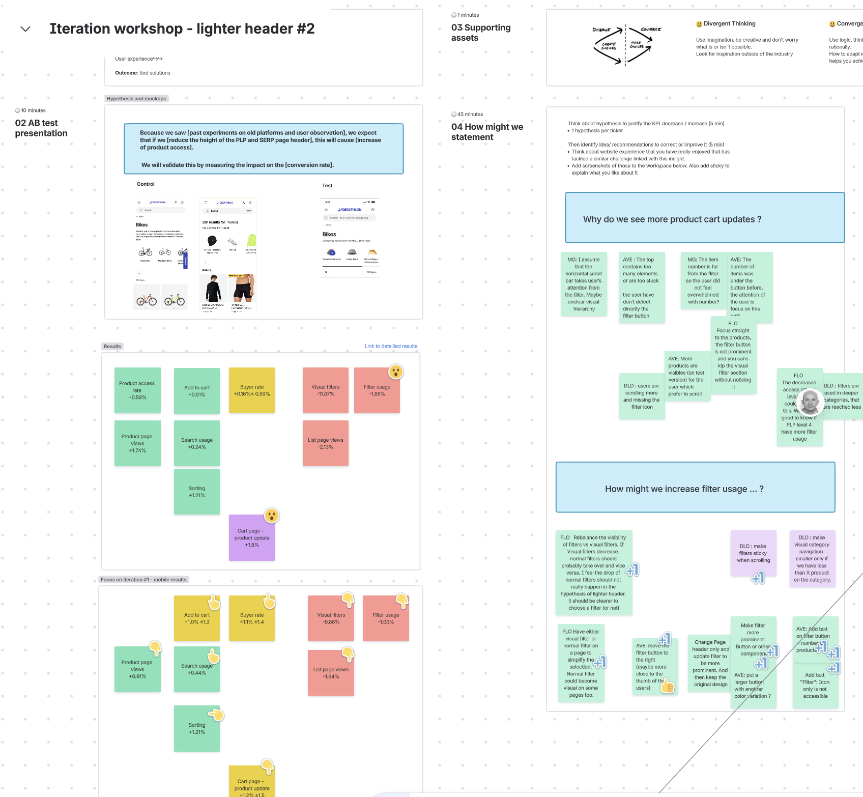
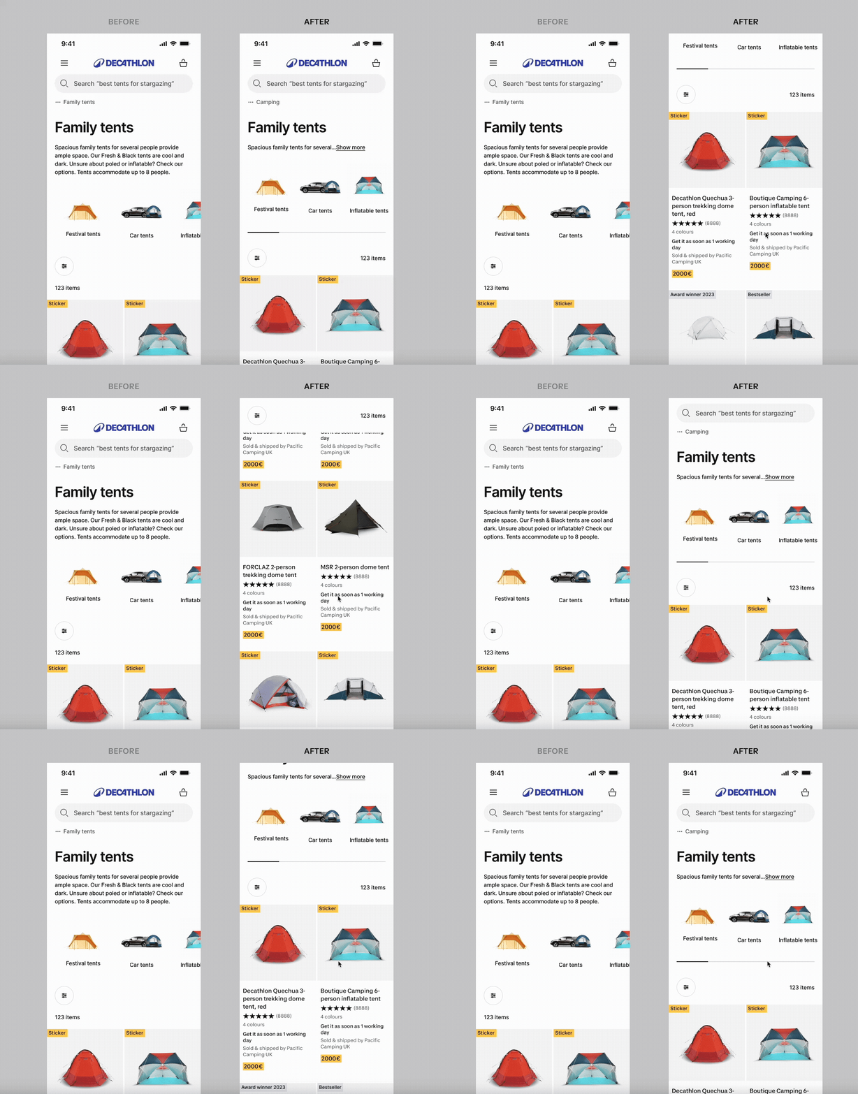
3rd AB Testing Result
CVR: +0.16%± 0.59%
Add to cart: +0,51% ✅
Search usage: +0.24%❓
Filter usage: -1.65%❓
Visual filter usage: -11.07% ✅
Product CTR: +1.74% ✅
💡What I learned
This iteration showed that A/B tests can be skewed by novelty effects—early excitement that doesn’t reflect long-term behavior. Success in another country or on a previous product version doesn’t guarantee the same results here. Our revamped product creates a different experience, so every change needs to be tested and validated in its own context.
3-3. 4th Iteration
💡 Improving Category Recognition and Direct Access by Highlighting the Current Category
From the previous A/B test, I learned that reducing the header height helps users access products more easily. During design critique, I also received feedback that images in the visual category shelf were often subjective.
To gain more meaningful learnings, we made a bold change instead of small tweaks. I redesigned the visual category shelf by removing both images and breadcrumbs to improve clarity and usability.
[Hypothesis] Simplifying visuals and navigation will help users better recognize their current category, improving orientation and engagement.
CVR: -1,6%
Breadcrumb usage: +401% ✅
Filter usage: +22% ✅
Visual filter usage: -47% ✅
PLP Views: -11% ✅
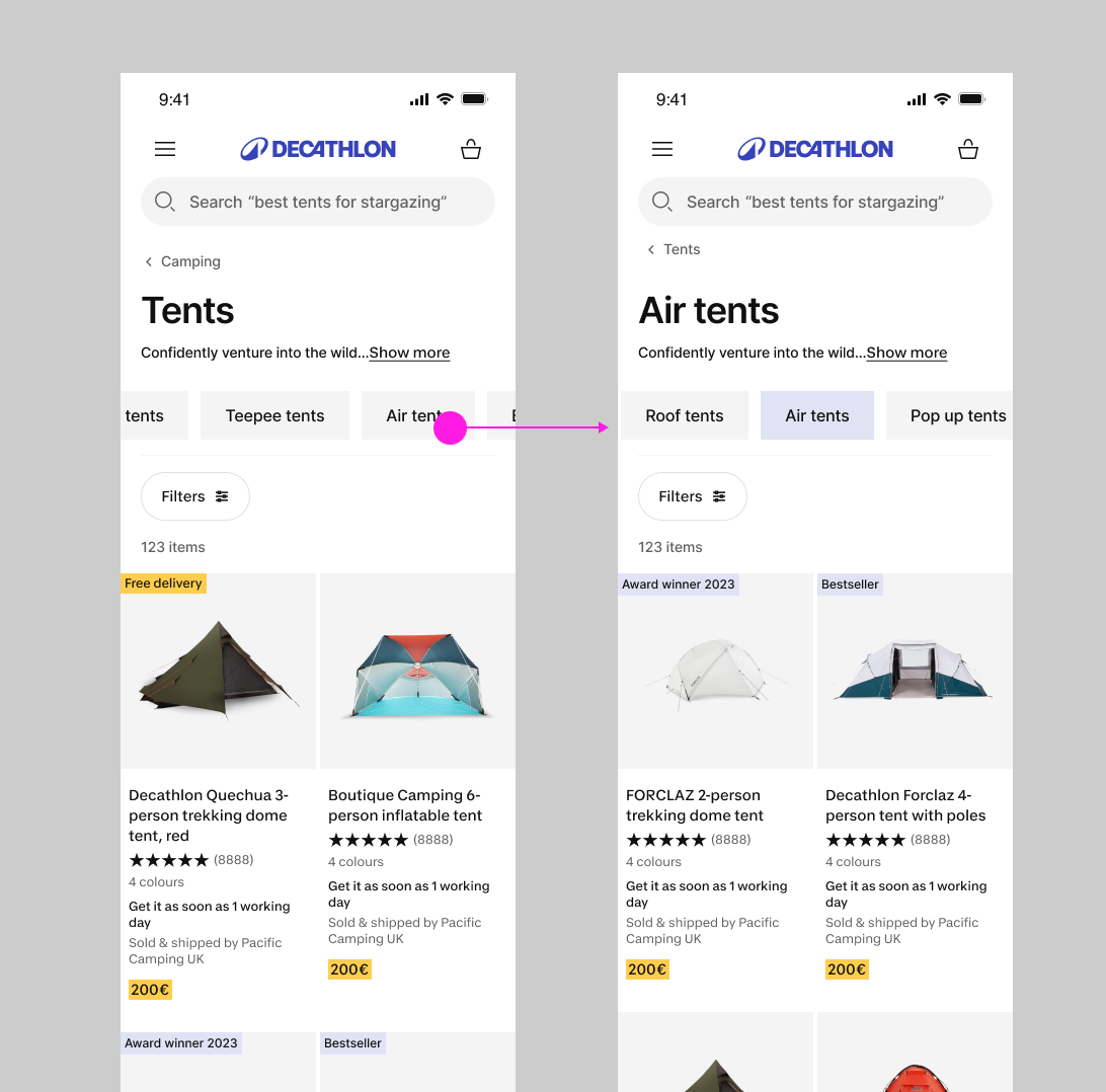
4. A Step Back: Diving Deeper into the Data
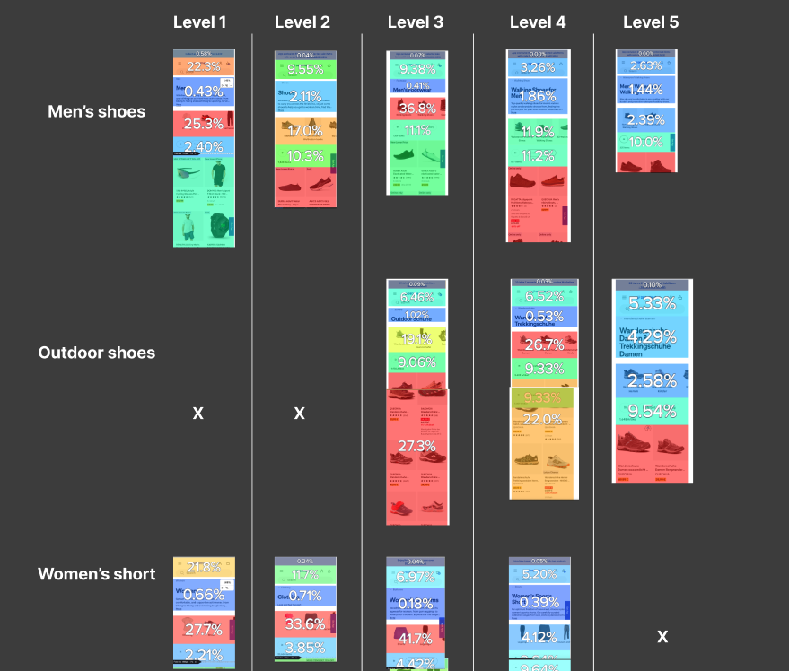
After running three experiments without identifying a clear winner, I organized a workshop with the PM, data analyst, and UX researcher to dive deeper into the data.
We began by defining our key goals, then formulated research questions. From there, we selected the most appropriate research methods such as amplitude, UT, and Content square to uncover actionable insights and validate our assumptions.
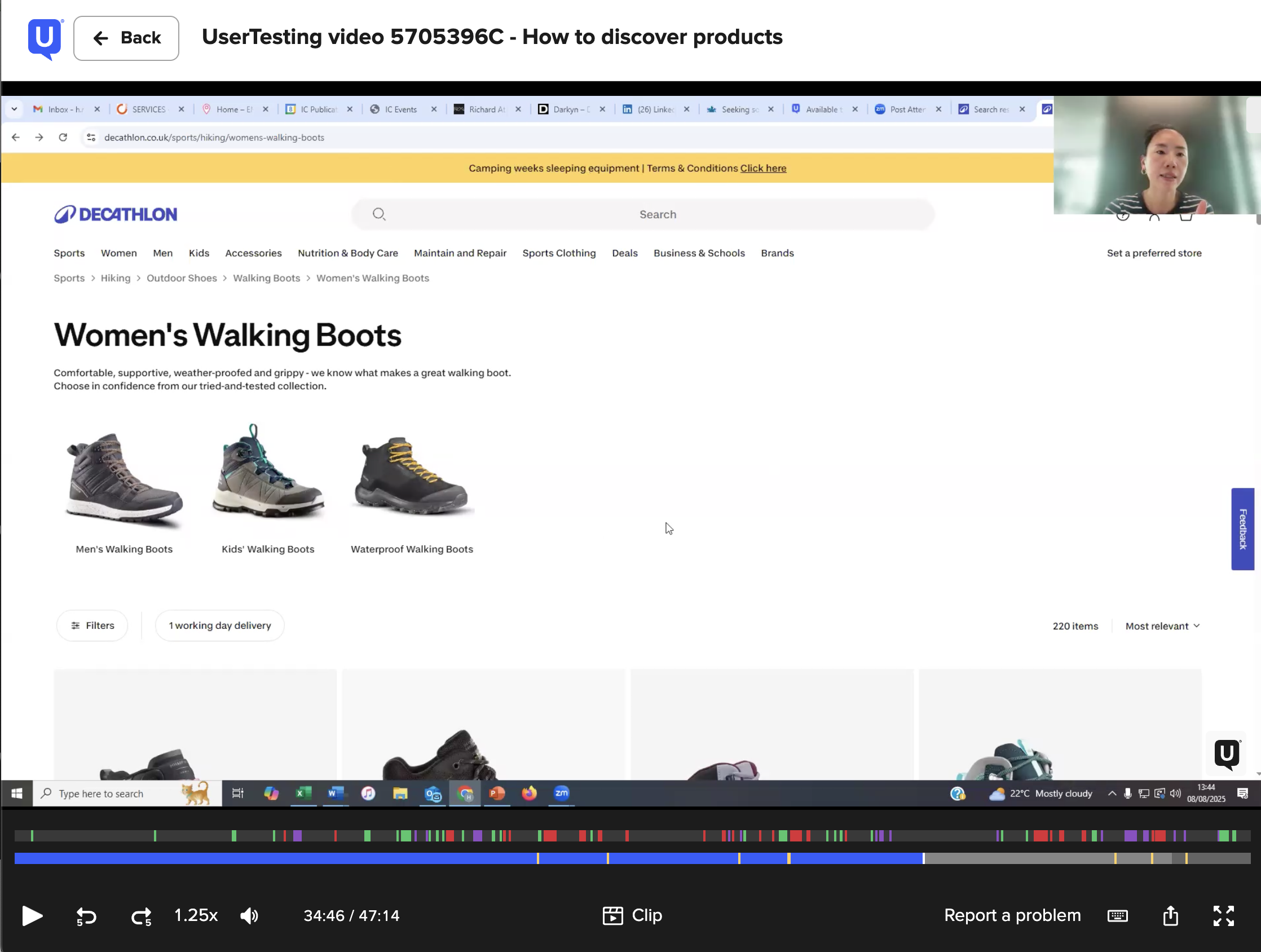
In addition, I built user testing script and moderate UTs with 9 users in 4 markets for a discovery purpose.

Our key objectives:
Confirm the understanding and expectations of users with the visual category shelf : act as a filter or navigation
Evaluate their level of confusion with the current experience and its severity of its impact on the customer journey.
Evaluate if users understand what are the categories listed under the current category name at the last level of the catalog tree.
Evaluate which level of PLP shows the best performance. (especially the lowest level of the catalog tree)
Key Insights: The Funnel Fragility Paradox
L3 (Exploration Hub): High conversion potential but high navigation anxiety. Users rely heavily on filters and search to escape "discovery fatigue."
L4 (Focused Transition): Browsing behavior stops. Visual category tools are ignored as users shift from exploration to hunting.
L5 (High-Intent/High-Risk): Users are exhausted and unforgiving. Intent is at its peak, but any product mismatch or friction triggers immediate abandonment.
The Core Rule: As depth increases, exploration decreases and fragility rises.
5. Solutions
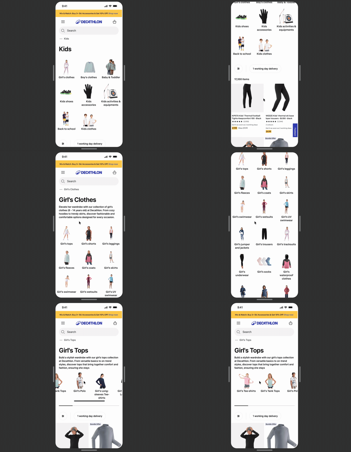
Broad level of PLP
👤 User Story: Efficient Category Discovery
As the user arriving at a broad level of the PLP (Level 1 or 2)—either directly from search or by navigating down to the deeper level —I want to encounter prominent sub-category options immediately so that I can effectively bypass overwhelming article counts, reduce my total browsing time, and navigate straight to the specific category that matches my intent.
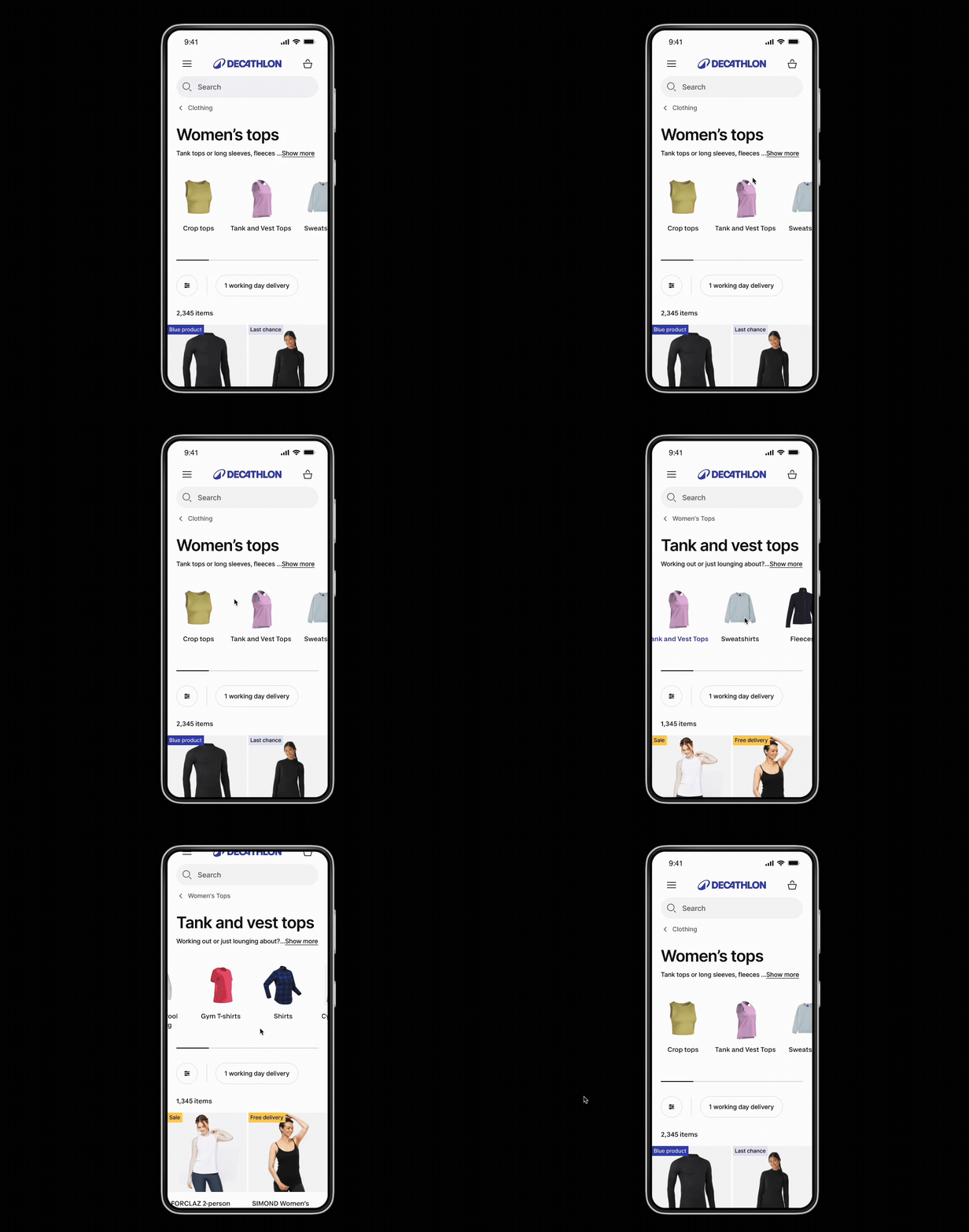
Deepest level of PLP
👤 User Story: Path Readjustment & Exploration
As the user who has reached the deepest sub-category level but cannot find a suitable product, I want to easily access sibling categories or navigate back to a broader level via clear visual cues So that I can readjust my browsing path and continue my exploration without leaving the site
5-1 Efficient Category Discovery on the broad level of the PLP
5-2 Path Readjustment on the last category PLP
Impact
Efficient Category Discovery on the broad level of the PLP
+3,72CVR Uplift
+4,93M €
Business value (12 months)